css学习
#声明
本学习笔记摘自 http://www.aa25.cn/div_css/903.shtml 特此声明。
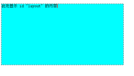
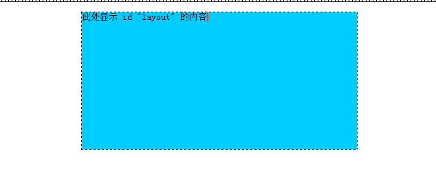
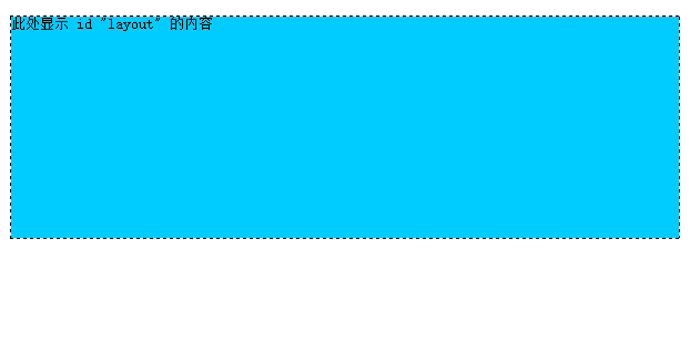
此处显示 id "layout" 的内容
一列固定宽度
<style type="text/css">
<!--
#layout {
    background-color: #00FFFF;
    height: 200px;
    width: 400px;
}
-->
</style>
截图如下:
一列固定宽度居中
<style type="text/css">
<!--
#layout {
    background-color: #00CCFF;
    margin: auto;
    height: 200px;
    width: 400px;
}
-->
</style>
margin 设为auto时,布局居中。
截图如下:
##一列自适应宽度
自适应宽度是相对于浏览器而言,盒模型的宽度随着浏览器宽度的改变而改变。这时要用到宽度的百分比。当一个盒模型不设置宽度时,它默认是相对于浏览器显示的。我们把刚才的固定宽度例子中的宽度去掉看看:
<style type="text/css">
<!--
#layout {
    background-color: #00CCFF;
    margin: auto;
    height: 200px;
    }
-->
</style>
截图如下:
有些朋友可能要问了,那为什么还有那么宽的白边呢?这个是由body默认的外边距造成的。当我们不用任何样式表进行定义时,body,h1-h6,ul等元素默认有外边距或其它样式的。这里我们在css样式中增加一项:body {margin:0;},就可以把body默认的外边距去掉,这时再预览一下,白边就没了。
    <style type="text/css">
    <!--
    body {margin:0;}

    #layout {
        background-color: #00CCFF;
        margin: auto;
        height: 200px;
    }
    -->
   </style>
浏览器宽度的80%显示
<style type="text/css">
<!--
body {margin:0;}

#layout {
    background-color: #00CCFF;
    height: 200px;
    width: 80%;
}
-->
</style>
截图如下:

浏览器宽度的80%居中显示
<style type="text/css">
<!--
body {margin:0;}

#layout {
    background-color: #00CCFF;
    height: 200px;
    width: 80%;
    margin: auto;
}
-->
</style>
添加了: margin: auto;
截图如下:

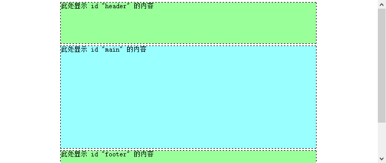
一列二至多块布局
一般的网站整体可以分为上中下结构,即:头部、中间主体、底部。那么我们可以用三个div块来划分,分别给它们起名为:头部(header)、主体(maincontent)、底部(footer)。
采用固定宽度居中的方式,代码如下:
<style type="text/css">
    <!--
    body { margin:0; padding:0;}
    #header { margin:5px auto; width:500px; height:80px; background:#9F9;}
    #main { margin:5px auto; width:500px; height:200px; background:#9FF;}
    #footer { margin:5px auto; width:500px; height:80px; background:#9f9;}
    -->
</style>
截图如下:
blog comments powered by Disqus